Two-thirds of Americans now own and regularly use smartphones, and nearly three-quarters of those adults search for local information on their phones before visiting local businesses. This data points to a major shift in the way consumers get online and make choices about where to take their business. If you want to be seen online, you must start taking advantage of the opportunities mobile offers.
Are You Mobile Use Friendly?
Unfortunately, many websites aren’t doing just that. If you own or operate a website that doesn’t display properly on mobile. You might actually be penalized in search engine results. Google announced in June of 2014 that it would start adjusting search result rankings based on how well a website handles mobile visitors. For instance, 404 pages, videos that won’t play, improperly-sized images, and hard-to-read text could all negatively affect a site’s rankings.
Have You Thought About Your Icon?
Another telling move is the addition of “not-mobile-friendly” icons to some mobile search results. The icon, showing a smartphone with a slash through it, could potentially discourage mobile searchers from visiting a site. These decisions clearly show Google’s philosophy on the matter of mobile search: If your website can’t handle mobile visitors, Google isn’t going to send them to you.
That means it’s vital for your site to start handling mobile well. If you aren’t set up for mobile yet, how do you get started?
Two Ways to Handle Mobile
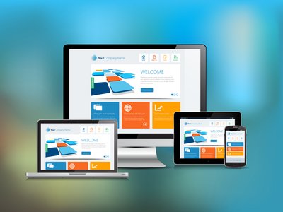
Website owners have two real ways to handle mobile visitors: responsive websites, and dedicated mobile sites. Each solution has its advantages and disadvantages. So you’ll need to decide which one is right for you depending on your goals and preferences. We’ll take a look at each type of site to help you make the choice.
Option 1: Responsive Web Design
Many business owners today are solving the mobile question with responsive websites. These sites handle mobile in an interesting way. Rather than directing users to a separate site, they simply resize the entire website to fit the display of the device the visitor is using. That means that a visitor to your site using a laptop would see a “full-size” version of the site. While a mobile visitor would see a version that is optimized to fit their smaller screen.
With a responsive website, the overall design of your website stays the same, but individual elements (such as images, text, and menu bars) change to suit the device. This has a number of advantages over other solutions, but it can also pose some technical challenges.
Advantages of Responsive Web Design:
- Only One Site – The biggest advantage of a responsive website is that it allows you to keep the same site across all devices. This makes it easier to make changes to your site, keep track of all your content and pages, and ensure a consistent experience for your visitors.
- Only One URL – Your site’s web address is important for both search engine rankings and for online name recognition. Using a responsive design allows you to keep the same URL across all devices, making it easier for visitors to know where they are online.
- Protection from Bounces – In web design speak, a page’s “bounce rate” is the percentage of visitors who come to one page on the site and then leave without going anywhere else. Mobile sites often have a high bounce rate, since they offer a “stripped-down” experience with less design and content. A responsive website avoids that problem by offering all users the same content, regardless of platform.
- Lower Costs – Because you only have to operate a single website, you keep your costs down. One website is cheaper to run than two.
Disadvantages of Responsive Web Design:
- Responsive Design Doesn’t Always Respond – While the idea of responsive design is to offer a unified, easy-to-use experience for all users, sometimes your site may actually pose challenges you didn’t intend. Sites that are improperly optimized for mobile can drive off mobile users who want a simple, clean experience.
- Mobile Has Different Needs – Smaller screen sizes and touch-based interfaces mean you may have to put emphasis on different parts of the same page to achieve conversions from both desktop and mobile. This can be complicated unless you’re an experienced web designer.
- Technical Difficulties – Older computers or browsers may not always render responsive sites correctly. Plus, new phones or browser apps may also have challenges with a mobile site that hasn’t been updated regularly.
Option 2: Dedicated Mobile Site
Responsive web design isn’t for everyone. Many site owners prefer the relative safety of a dedicated mobile site. While there are some difficulties to operating a mobile site alongside a desktop version, mobile sites also offer a number of advantages that site owners appreciate.
The chief draw of mobile sites is that they are designed from the beginning for display on a mobile screen. This ensures the content, interface, and design are consistent and optimized for mobile visitors. Mobile sites also handle slower internet connections better than responsive sites, offering quick load times to visitors on cellular connections. This is important for visitors. Google actually uses load times as a factor in its search engine rankings.
Advantages of Dedicated Mobile Sites:
- Better User Interface – By offering a site designed specifically for mobile users, you ensure that the interface and design of the site handles mobile well. This is a big advantage over many responsive sites that try to shoehorn a desktop experience onto mobile.
- Speed – Mobile websites often have less elements (pictures, videos, advertisements) that take time to load over cellular connections. This will make your site load faster on mobile devices, and it will also save your visitors from using all of their data allotment on loading your site.
Disadvantages of Dedicated Mobile Sites:
- Cost – Since you have to design, implement, and manage two websites, it’s understandable that a dedicated site costs more than a responsive one. However, dedicated sites don’t cost as much as you’d think to develop. So this isn’t a huge negative.
- Technical Challenges – If users on mobile devices try to visit your desktop page, you’ll need to automatically redirect them to the mobile site. This can present some challenges. Especially if you have a large or complicated site structure.
- Two Sites to Run – With a responsive website, any change you make is automatically applied to the entire site. Dedicated mobile sites are separate from their desktop counterparts. Meaning any change you make to one, you’ll have to make to the other too.
- Two URLs – Mobile sites have a different URL than desktop sites. This can make your site a little harder to market. Though with automatic redirects its not as challenging as it used to be.
What About Apps?
Many companies have turned to a third solution to the mobile problem: mobile apps that take the place of the mobile website entirely. Often you’ll be prompted to download and install the mobile app when you visit one of these sites. It’s easy to see why owners and designers like apps. They’re not hard to design. They ensure a consistent mobile experience. They can also collect and send back more customer data than a website can. However, apps aren’t a true mobile site solution.
Is Creating An App The Cure All?
When you create an app for mobile users, the app doesn’t take the place of your website. Mobile users that don’t want to download an app will still use your site, and if your site isn’t mobile-friendly, you’re back to square one. Plus, Google and other search engines don’t look at apps when deciding search engine rankings. They aren’t going to rank content that can only be found in an app. You could design the best app in the world put the best content on it, and you’d still lose out on rankings because your actual website doesn’t handle mobile visitors well.
Do Apps Work On All Devices?
Unfortunately apps don’t all work on all devices. You’ll need to develop separate apps for Apple, Android, and Windows Phone devices – a costly proposition. When you consider the costs of maintaining and updating apps across all platforms and devices (each one with its own software update schedule and conflicting requirements), you can see that apps are not a great solution for the vast majority of business owners.
Will You Be Left Behind?
The Internet is only going to become more and more mobile-centric in the coming years. If you want to perform well online and get business out of your website, you need to take advantage of the mobile space. Otherwise, you’ll be left behind.
To learn more about generating conversions and leads from your website, contact us today at (405) 605-8218. We’re a local Oklahoma City Internet marketing firm. We can help you on the path to online success.